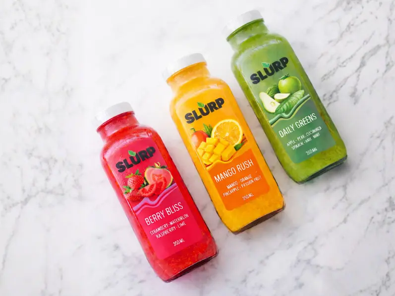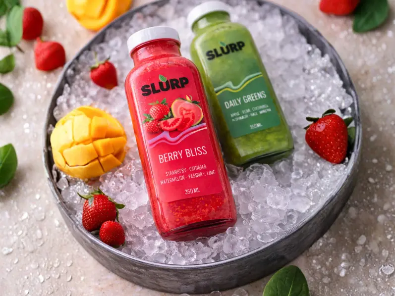
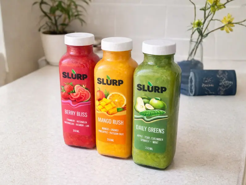
SLURP is a youth-focused smoothie and juice brand created to offer a healthier alternative to sugary drinks available in colleges and quick-grab food spaces.
The objective was to design a packaging system that instantly communicates freshness, flavor clarity, and energy while remaining visually bold enough to stand out in refrigerators and vending machines.
The brand needed packaging that:
1. Attracts attention from distance (3–5 ft visibility)
2. Helps customers choose quickly without reading too much
3. Feels fun and approachable rather than “diet” or “medical health”
4. Works across multiple flavors using a consistent system
5. Appeals primarily to students and young working consumers
We developed a color-coded flavor architecture supported by fruit illustrations and a strong
typographic logo placement.
Key strategies:
• Large central logo for brand recall
• Flavor colors for fast decision making
• Ingredient illustrations to reduce cognitive effort
• Minimal text hierarchy for quick scanning
• Friendly rounded typography to reflect approachability
• Balanced negative space to avoid clutter in small packaging formats
The layout was designed keeping vending machines and refrigerator shelves as the primary display
environment.
The final packaging successfully communicates freshness + energy + simplicity while maintaining strong brand recall across multiple variants.